Scale activity
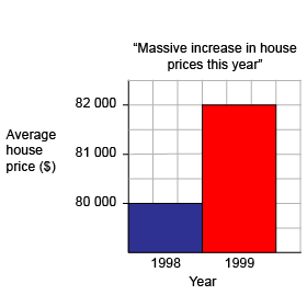
This is one type of a misleading graph. The activity begins with a discussion about the graph. Students are then asked to write about the same information when the graph is drawn accurately.
Average house prices
Discussion points
- What is the headline?
- Glancing at the graph, by how much do you think house prices have risen?
- What do you notice about the vertical scale on the graph?
- Why is the representation misleading?
- Why do you think a newspaper would produce a graph such as this?
Activity
This graph has used the same information but with a correct scale.
Average house prices
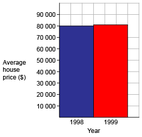
Now imagine you are a journalist about to write an article. What would the headline be?
Write a paragraph for the newspaper using the mathematical information. Include the approximate percentage rise in prices.
Further activity
Collect graphs that appear in your local media. Are any misleading or confusing?