Home > Topdrawer > Statistics > Misunderstandings > Misleading graphs > Misuse of area
Misuse of area
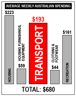
This bar graph is attempting to draw attention to the amount of money spent weekly by Australian households on transport compared to other categories of household expenditure.
Colouring 'Transport' red and making the area of the bar twice as wide gives the impression that this represents twice the amount of money as the other bars.
Even the vertical scale is misleading in that the bar for 'Household Furnishings and Equipment' ($59) should be taller compared to 'Housing' ($223), but 'Transport' ($193) should be shorter.
There is advice for teaching area for graphs and an activity for students about area in graphs.

